
Every day, people see countless badges on a car. These small car emblems are everywhere on an automobile. Few people know the true origins or meaning of these famous hidden symbols. They are not just pretty pictures. Instead, each emblem serves as a powerful symbol, telling a rich story of history, innovation, and brand identity. What stories do these familiar designs truly hide? This blog explores 25 iconic designs and their fascinating secrets, revealing their hidden meanings.
Key Takeaways
Car emblems are more than just pictures; they tell stories about a brand’s history and identity.
European car emblems often show heritage and power, like Mercedes-Benz’s star for land, sea, and air.
American car emblems represent new ideas and freedom, such as Ford’s Blue Oval for reliability.
Asian car emblems highlight precision and culture, like Toyota’s ovals showing trust between company and customer.
Luxury car emblems, like Rolls-Royce’s ‘Spirit of Ecstasy,’ symbolize elegance and a rich legacy.
European Car Emblems: Heritage and Power
European car brands boast some of the most famous logos in the world. These recognizable logos often carry deep historical and cultural importance. They represent heritage and power.
Mercedes-Benz: Three-Pointed Star Meaning
The Mercedes-Benz emblem, a three-pointed star, holds a special meaning. Daimler-Motoren-Gesellschaft (DMG) applied for legal protection for this star on June 24, 1909. The Register of Trademarks officially entered the three-pointed star on February 9, 1911. The three points of the Mercedes-Benz star originally symbolized different types of mobility: land, sea, and air. This represented the company’s ambition to dominate all forms of motorized transport. On February 18, 1925, both Daimler and Benz registered their new shared logo. This combined Daimler’s Mercedes star with Benz’s laurel wreath. This happened in anticipation of their merger. The merger of Daimler and Benz became effective on June 28, 1926. This led to the creation of the Mercedes-Benz trademark.
BMW: Propeller Myth and Symbolism
The BMW emblem features a blue and white circular design. Many people believe the BMW logo is a stylized propeller. This is a popular myth. Fred Jakobs of BMW Group Classic explains, “For a long time, BMW made little effort to correct the myth that the BMW badge is a propeller.” He also noted, “This interpretation has been commonplace for 90 years, so in the meantime it has acquired a certain justification.” The common misconception that BMW’s logo is an airplane propeller originated from a 1929 advertisement. This ad promoted the company’s new aircraft engine. It strongly associated the logo with BMW’s origins as an airplane manufacturer. This perception was further spread in 1942 by a similar ad in a BMW-based publication, “Flugmotoren-Nachrichten” or “Aircraft Engine News.”
The truth is a little different. The blue and white colors are directly from the Bavarian flag. This symbolizes BMW’s origins and pride in its home region of Bavaria, Germany. These colors also represent innovation and trustworthiness (blue), along with purity and precision (white). The circular shape comes from its predecessor, Rapp Motorenwerke. This design element shows continuity, stability, motion, unity, and completeness. It aligns with BMW’s engineering philosophy.
Audi: Four Rings of Union
The Audi four rings emblem has a significant history. The Audi trademark, featuring four interlocking rings, symbolizes the merger on June 29, 1932. This merger joined four independent car manufacturers: Audiwerke AG, Horchwerke AG, Zschopauer Motorenwerke J. S. Rasmussen AG (DKW), and Wanderer Werke AG. This consolidation created Auto Union AG. It became Germany’s second-largest motor vehicle group. The interlocking rings represent the ‘inseparable unity’ of these four founding companies. Each company kept its brand name and specialized in a specific market segment.
The four rings of the Audi emblem symbolize the 1932 merger of these four German automotive manufacturers. Each ring represents one of these original companies. They signify their unity and collective effort to overcome economic challenges and competition. Each company brought unique qualities. Audi was known for engineering innovation. DKW specialized in small, affordable cars. Horch represented luxury vehicles. Wanderer produced practical, reliable mid-sized cars. Beyond representing the merger, each ring carries a specific symbol. Audi’s ring signifies progress. DKW’s ring embodies ingenuity. Horch’s ring represents luxury. Wanderer’s ring embodies the spirit of exploration.
Volkswagen: People’s Car Initials
The Volkswagen emblem features the initials ‘VW’. These initials stand for ‘Volkswagen’. This translates to ‘people’s car’ in German. This directly reflects the brand’s original mission. That mission was to create an affordable car for the masses. Adolf Hitler championed this concept in 1937. He envisioned providing an accessible vehicle for all Germans.
Porsche: Stuttgart Coat of Arms
The Porsche emblem is rich with regional history. The horse on the Porsche emblem represents the city seal of Stuttgart, Germany. This symbol honors Stuttgart’s history as an agricultural city. It was also an important area for horse rearing. The name ‘Stuttgart’ itself comes from the old German word ‘stuot,’ meaning ‘mare.’ This further emphasizes the city’s connection to horses. The antlers and red and black stripes on the emblem come from the coat of arms of Württemberg. This was the former German state where Stuttgart is located.
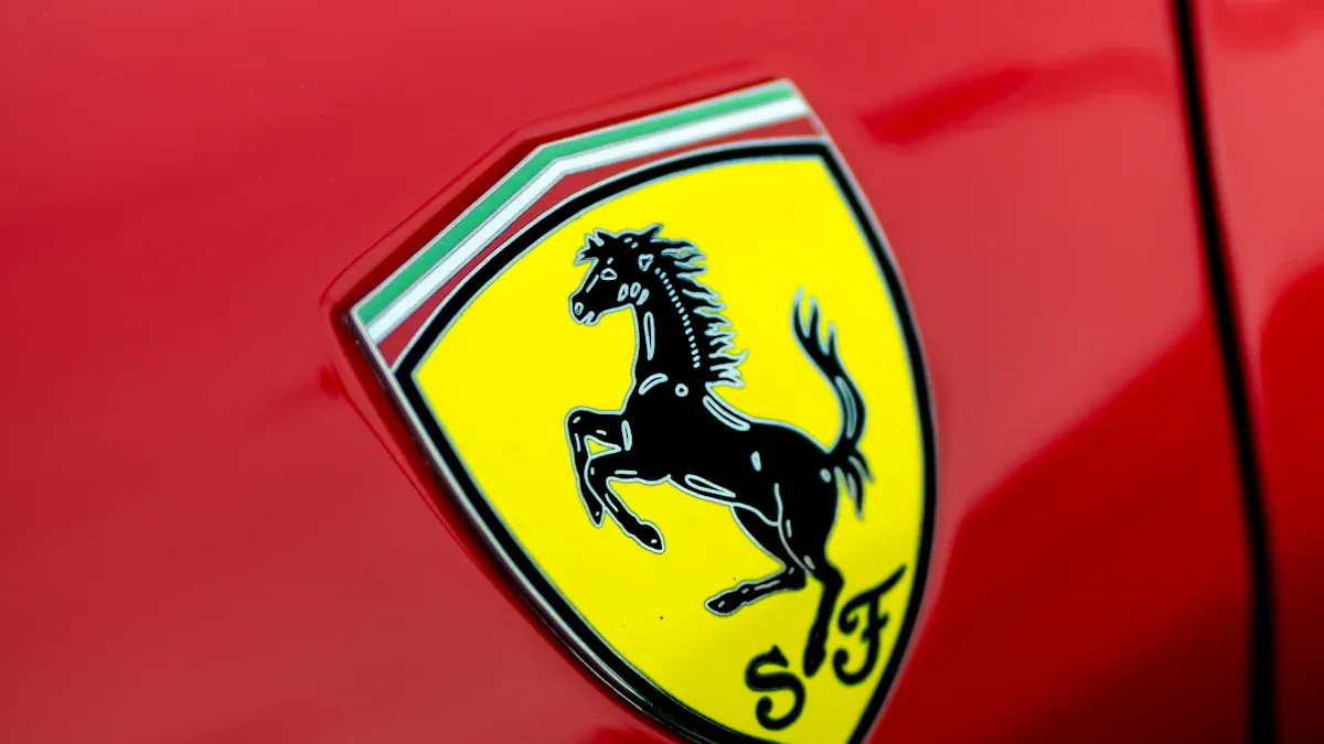
Ferrari: The Prancing Horse
The Ferrari emblem features a black prancing horse. This famous symbol has a fascinating origin. Francesco Baracca, an Italian flying ace, first used the Prancing Horse in 1917. He adopted it as a personal symbol for his aeroplane. Baracca claimed in an April 1918 letter that he adopted the horse in tribute to a cavalry regiment he belonged to. This regiment had used a similar symbol since 1692. Baracca’s horse was black for better visibility on his plane.
In 1923, after a race win, Enzo Ferrari met Baracca’s parents. Countess Paolina Baracca suggested he use the prancing horse for good luck on his cars. Enzo Ferrari adopted the black horse. He added a canary yellow background, the color of Modena, his hometown. The Prancing Horse first appeared on Scuderia Ferrari’s cars on July 9, 1932, at the Spa 24 Hours race. It brought the team victory. When Ferrari was founded in 1947, the emblem became the brand’s symbol. It appeared on the first Ferrari car, the 125 S.
Lamborghini: The Raging Bull
The Lamborghini raging bull emblem is a powerful image. It is inspired by Ferruccio Lamborghini’s family coat of arms. This coat of arms featured a rampant golden bull. This symbol was chosen to represent power, strength, and an unyielding spirit. These values aligned with what Ferruccio wanted for his high-performance sports cars. Ferruccio Lamborghini’s zodiac sign was Taurus, which is a bull. He was also a fan of bullfighting. This further influenced the choice of a bull in a fighting stance for the emblem.
Alfa Romeo: Milan’s Heraldic Symbols
The Alfa Romeo logo incorporates two distinct heraldic symbols. These symbols come from Milan, Italy. The red cross on a white background is the flag of Milan. It symbolizes medieval history and the Crusades. The biscione, a green snake on a light blue background, is the other symbol. This azure serpent is depicted consuming a human. It was originally the emblem of the House of Visconti from the 11th century. It later became associated with the Duchy of Milan. The red figure in the serpent’s mouth is a human. This was adopted from the Visconti family crest. It signifies power and influence. The serpent itself has become a symbol of Milan.
Volvo: Iron Mark of Strength
The Volvo emblem features the ancient symbol for iron. This symbol was chosen to represent strength and resilience. This fits well for a company whose name ‘Volvo’ means ‘I roll’ in Latin. Thus, it signifies ‘Rolling Strength.’ This ‘Iron Mark’ has been part of Volvo’s identity since its first car in 1927. The diagonal ‘Volvo Slash’ initially served a functional purpose. It attached the emblem to the car. The Volvo logo, known as the ‘Iron Mark,’ is an ancient alchemist’s symbol for iron. It is also associated with the planet Mars. This symbol has special significance. It signifies strength, energy, and power. The founders were inspired by Sweden’s strong steel industry. They chose this symbol to convey a powerful image.
Peugeot: Lion of Sochaux
The Peugeot emblem features a majestic lion. The lion emblem was first conceived in 1847 by Jules and Emile Peugeot. They commissioned jeweler and engraver Julien Blazer to create a logo for their products. The lion was chosen because its characteristics-strong teeth, supple blade, and swiftness of cut-mirrored the qualities of the saws Peugeot produced. The lion quickly became Peugeot’s sole registered trademark. It appeared on various products. These included tools, saw blades, coffee grinders (by 1881), bicycles (from 1882), and motorcycles (from 1898). The lion also aligned with the coat of arms of Franche-Comté, Peugeot’s founding region, which features a rearing lion.
American Car Brand Logos: Innovation and Freedom

American car brands often represent innovation, freedom, and a pioneering spirit. Their car emblems tell stories of ingenuity and national pride. These car brand logos have become globally recognized symbols of American automotive history.
Ford: Blue Oval Legacy
The Ford emblem, known as the Blue Oval, has a long history. When Ford Motor Company started in 1903, its first logo was an ornate circular crest. It featured frilly vines and stated ‘Ford Motor Co. Detroit, Mich.’ A big change happened in 1906. Chief engineer C. Harold Wills designed the flowing script that people still recognize today. This lettering came from a typesetting kit. Many people mistake it for Henry Ford’s signature. It made the company’s branding feel more personal.
The Ford logo evolved over time.
1903-1907: The first logo was an elaborate emblem. It had ‘Ford Motor Co’ and ‘Detroit Mich’ inside a frame of leaves and swirling shapes. It used black, white, and a wave-like letter design.
1907-1909: The logo became simpler. It removed the fancy border and cursive. It used bold ‘FORD’ letters in an oval. Phrases like ‘Every car guaranteed twelve months’ appeared. It also added shades of gray.
1909-1912: This logo started to look like the modern version. It featured ‘Ford’ in a script style. This style resembled Henry Ford’s handwriting. It had a distinctive stretched ‘D’.
1912-1917: This version introduced blue and an eagle’s wings design.
1917-1927: The logo returned to an oval with a black border and grey background.
1927-1957: This logo brought back the blue and white colors. It had white ‘Ford’ lettering on a blue background. This was the first variation of Ford’s iconic blue oval logo. It came out in 1927 with the Ford Model A. This initial blue oval design was slightly rounder. It featured white lettering on a blue background. It had a two-tone white and blue frame. This made the inner image stand out more. This simplified blue and white logo became the model for future versions. It was used for about 30 years with few changes.
1957-1961: This logo continued the blue oval theme.
1961-1965: This logo maintained the blue oval.
1965-1976: This logo was consistent with the blue oval design.
1976-Today: This logo introduced a 3D effect and a modern edge. It was a shadowed, elongated blue oval with silvered lettering and outline.
2003: This was the ‘Centennial Blue Oval’. It was a modernized version of the 1976 design.
The Blue Oval represents reliability, quality, and the company’s long-standing commitment to automotive excellence.
Chevrolet: Bowtie Mystery
The Chevrolet bowtie emblem is one of the most recognizable car emblems. Its exact origin remains a mystery, with several theories.
Paris Hotel Wallpaper: ‘The Chevrolet Story’ (1961) states that co-founder William ‘Billy’ Durant saw a design on Parisian hotel wallpaper in 1908. He thought it would be a perfect emblem for Chevy. He reportedly tore off the design to take home.
Dinner Table Doodles: Durant’s daughter, Margery, wrote in her 1929 book that her father often doodled potential logo designs at the dinner table. She believed the bowtie emblem came from these sketches. She recounted in her book ‘My Father’ that he sketched the design one evening while eating.
Newspaper Advertisement: Durant’s widow, Catherine, said in a 1950s interview that Durant saw a design in a newspaper. This happened while he was on vacation in Hot Springs, VA, in 1912. He remarked it would be a good emblem for Chevrolet. Historian Ken Kaufmann later found a November 1911 advertisement for a coal company in ‘The Constitution’. It had a similar slanted, cross-like design. This suggests Durant might have seen this ad. Durant’s wife believed the bowtie was inspired by a newspaper advertisement for ‘Coalettes’. This product came from the Southern Compressed Coal Company. Kaufmann found a 1911 Coalettes ad that looked very much like the Chevy bowtie.
Swiss Flag Inspiration: Another idea suggests Louis Chevrolet, the brand’s namesake and co-founder, might have found inspiration in the Swiss flag. This is because of his Swiss heritage.
The bowtie symbol has come to represent Chevrolet’s commitment to value, reliability, and widespread appeal.
Cadillac: Crest of Detroit’s Founder
The Cadillac crest emblem connects to Antoine de la Mothe Cadillac, the founder of Detroit. The Cadillac company incorrectly claimed the crest was centuries older than Columbus. They also claimed the Cadillac family was ancient in France. However, research in France has not found any ancient, noble Cadillac family connected to Antoine Laumet. There is also no crest like the one used on Cadillac cars since 1906.
Antoine Laumet adopted the name Antoine de la Mothe Cadillac. He created the Cadillac coat of arms himself around the turn of the 17th century. The Cadillac coat of arms is a collection of real heraldic elements. Laumet put them together for his own purposes. Many writers and historians confirm the Cadillac family crest is a fabrication. This is true even though it was officially registered around 1687 in Quebec. The crest features a shield with various elements. These include ducks (merlettes), a crown, and a wreath. These elements traditionally symbolize nobility, wealth, and power. The crest reflects Cadillac’s identity as a luxury brand. It signifies elegance, prestige, and American automotive excellence.
Dodge: Ram’s Head Power
The Dodge ram’s head emblem is a powerful symbol. By the early 1990s, Dodge wanted to make its truck lineup better. It needed a special logo to show the brand as powerful. The ram’s head emblem was introduced to meet this need. The ram’s head symbolizes several strong qualities:
Authority
Force
Fearlessness
Virility
These meanings align with Dodge’s brand image. It represents toughness, capability, and a bold attitude. The emblem communicates the raw power and performance associated with Dodge vehicles.
Jeep: Iconic Grille and Name
The Jeep brand is famous for its iconic seven-slot grille. This grille is arguably the most recognized design feature of Jeep. It is even more recognized than text-based logos. The seven-slot grille is synonymous with the Jeep brand. It is instantly recognizable. It embodies the brand’s rugged personality and adventurous spirit. It has gone through small design changes. It keeps its main look while adapting to modern needs and technologies. The consistent use of seven slots became a hallmark. It strengthens the vehicle’s identity and functional performance.
The grille does two jobs: it allows airflow (functional) and looks good (aesthetic). It helps create Jeep’s recognizable and rugged shape. Modern Jeep grilles get a lot of influence from historical design features. These include the iconic seven-slat grille and round headlights. These have been consistent since the original models. These elements continue to change with sleek and aggressive designs. They keep their classic look. This balances heritage with modern styling. Early design choices, like the slat grille in the Willys MB, created a distinct look. It emphasized ruggedness and usefulness. These basic elements influence today’s Jeep grille design. They maintain brand recognition and continuity. They balance classic heritage and modern performance. The vertical slots stay constant across different Jeep models. This reinforces the brand’s identity. The meaning of the name “Jeep” itself is debated. Some say it comes from “GP” (General Purpose) vehicle. Others link it to Eugene the Jeep, a character from the Popeye cartoons.
Asian Car Emblems: Precision and Philosophy
Asian car brands are known for their precision engineering and thoughtful design. Their car emblems often reflect deep cultural philosophies and a commitment to innovation. These car brand logos tell stories of ambition, unity, and a forward-thinking approach.
Toyota: Overlapping Ovals and Hidden ‘T’
The Toyota emblem features three overlapping ovals. This design holds significant meaning. The two perpendicular ovals inside the larger oval represent the heart of the customer and the heart of the company. They overlap to show a mutually beneficial relationship and trust between them. This overlap also forms a ‘T’ shape. This ‘T’ stands for Toyota. It also looks like a steering wheel, representing the car itself. Early Toyota emblems also used three overlapping ovals. They symbolized the unification of the customer and the manufacturer in a simple, appealing design. The outer oval encompasses the inner two. It signifies the world embracing Toyota. It also represents the global reach of the brand.
Honda: Stylized ‘H’ of Ambition
The Honda emblem is a stylized ‘H’. This simple yet powerful symbol embodies a specific design philosophy. It represents strength, stability, movement, and speed. Its bold, angular lines reflect a commitment to innovation and performance. The emblem also incorporates Japanese design aesthetics. These include simplicity, balance, harmony, and minimalism. This connects to Honda’s cultural roots and heritage. The ‘H’ signifies the company’s name. It often appears with wings. These wings symbolize aviation origins, ambition, and the pursuit of dreams. They aim for new heights in engineering and technology. The emblem conveys values of quality, reliability, excellence, and progress. It shows a forward-thinking approach. This aims for distinctiveness and recognition of the brand’s values and aspirations. Historically, the Honda logo has featured a simple, bold emblem. The stylized ‘H’ often appears in a chrome or metallic finish. This symbolizes durability, reliability, and the integration of innovation with practicality.
Nissan: Rising Sun and Nameplate
The Nissan emblem incorporates elements of the rising sun. Its symbol is a depiction of the rising red sun. This is a heraldic Japanese symbol. Nissan borrowed this symbol from Datsun, its sister company. The meaning of the Nissan logo is inspired by Japan’s ‘Land of the Rising Sun’ nickname and Japan’s flag. Historically, the original Nissan emblem from 1933-1940 featured a red circle representing the sun. A blue rectangle across it contained the ‘Nissan’ wordmark. In the 1940-1950 logo, the ‘rising sun’ symbol was placed above the wordmark. It was contoured in thin white lines. The current Nissan logo, while evolved, still echoes these iconic elements. The circular emblem symbolizes unity and the rising sun.
Mazda: Wings of Ingenuity
The Mazda emblem features distinct wings. These wings symbolize the company’s dedication to continuous improvement and growth. Flexible thinking, creativity, and resilience drive this growth. In 1936, the wing shape was adopted. It represented agility, high speed, and rapid development. It combined three ‘M’s for ‘Mazda Motor Manufacture’ with Hiroshima City’s emblem. As a product emblem, the wings evoked the symbol of Ahura Mazda. This signified Mazda’s aspiration to create human-friendly and enriching vehicles. Established as the brand symbol in 1997, the ‘M’ with soaring wings embodies Mazda’s commitment to continuous self-reform and dynamic, unceasing growth. The 1936 emblem featured wings alongside an ‘M’ shape. This symbolized Mazda’s agility, speed, and potential for new heights. The 1997 ‘wings’ or ‘owl’ logo, designed by Rei Yoshimara, represents Mazda’s brand image globally. It signifies the company ‘stretching its wings’ with a distinctive ‘V’ shape.
Subaru: Pleiades Star Cluster
The Subaru emblem is a stylized representation of the Pleiades star cluster. This cluster is also known as Messier 45 (M45) or the ‘Seven Sisters’. The carmaker’s name, ‘Subaru,’ is the Japanese term for this specific star cluster. While commonly called the ‘Seven Sisters,’ only six stars are easily visible to the naked eye today. However, astronomical research suggests that approximately 100,000 years ago, seven stars, including Pleione, would have been distinctly visible. This explains the historical and cultural references to seven stars despite current observations. The emblem connects the car brand to the cosmos. It represents unity and the coming together of five companies to form Fuji Heavy Industries, Subaru’s parent company.
Hyundai: Slanted ‘H’ of Handshake
The Hyundai emblem features a slanted ‘H’. This design is intentional. It represents two individuals engaged in a handshake. One figure symbolizes a company representative. The other signifies a satisfied customer. This interpretation is explicitly stated by Hyundai. It conveys a message of trust and mutual respect. This is true despite the initial appearance of a simple ‘H’. The emblem’s meaning reinforces the brand’s commitment to customer satisfaction and strong relationships.
Kia: Bold New Identity
Kia recently unveiled a bold new identity. Its emblem features a redesigned logo. This new logo is a handwritten-type design. It connects the letters ‘K,’ ‘I,’ and ‘A’ with a continuous, unbroken line. This symbolizes the brand’s commitment to the future. It represents movement and inspiration. The new logo also has a symmetrical, rhythmic design. This reflects Kia’s confidence and rising aspirations. This modern emblem signifies Kia’s transformation. It shows its focus on electric vehicles and sustainable mobility solutions. It is one of the popular car emblems that has undergone a significant change to reflect a new direction.
Unveiling Hidden Symbols in Luxury Car Logos
Luxury car logos often tell stories of aspiration, heritage, and unique artistic vision. These exclusive car emblems represent more than just a vehicle; they embody a legacy of craftsmanship and prestige.
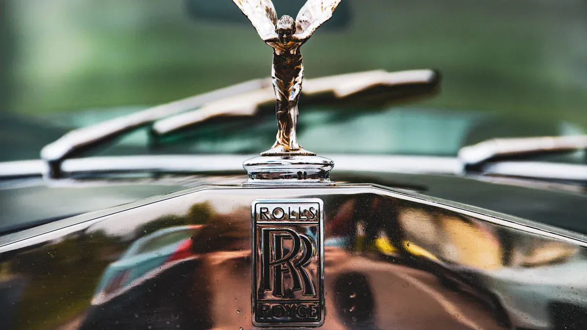
Rolls-Royce: Spirit of Ecstasy
The Rolls-Royce ‘Spirit of Ecstasy’ is one of the most iconic car emblems in the world. This famous figurine graces the hood of every Rolls-Royce car. Charles Sykes designed the ‘Spirit of Ecstasy’. He used Eleanor Velasco Thornton as his model. Sykes first created a figurine of Thornton called ‘The Whisper’. He made it for Lord Montagu’s 1909 Rolls-Royce Silver Ghost. This original figurine showed her with a finger to her lips. It symbolized the secret affair between Thornton and Montagu.
Claude Johnson, managing director of Rolls-Royce, commissioned Sykes to design a mascot. Johnson wanted a symbol that showed the spirit of Rolls-Royce. This spirit included ‘speed with silence, the absence of vibration, the mysterious harnessing of great energy, and a beautiful living organism of superb grace.’ Johnson suggested the ‘Winged Victory of Samothrace’ (Nike) as an idea. However, Sykes chose a more feminine and softer representation. He modified ‘The Whisper’ into what became the ‘Spirit of Ecstasy’. He added billowing cloth behind her to serve as her ‘wings’. This emblem represents the brand’s commitment to elegance, luxury, and unparalleled engineering.
Aston Martin: Wings of Speed
The Aston Martin wings emblem is a powerful symbol of speed and sophistication. The 1932 Aston Martin wings emblem is the most recognized form. It drew inspiration from Egyptian scarab beetles. Egyptology was very popular in the 1930s. Ancient Egyptians saw the scarab beetle as a symbol of the sun god and new beginnings. This was a fitting motif for the company. The company was restructuring at that time. Racing driver and The Autocar editor Sammy Davis designed this emblem.
The initial wings logo, introduced in 1932, was reportedly inspired by these scarab beetles. This design has changed several times over the decades. The most recent update to the Aston Martin wings logo happened in 2022. This was a team effort with British art director Peter Saville. This redesign aimed for a simpler look for the iconic emblem. Saville said the process clarified and highlighted the key features of the marque. He made subtle but important improvements. These changes allowed for future uses and technologies. The wings represent the brand’s pursuit of performance, freedom, and high-end prestige.
Maserati: Trident of Neptune
The Maserati emblem features the Trident of Neptune. This symbol has a rich mythological origin. It directly links to the Roman god Neptune. The trident is a symbol of strength, vitality, courage, and command of the seas. Mario Maserati, one of the Maserati brothers, chose this symbol. He found inspiration from the Late Renaissance-era Fountain of Neptune in Bologna’s Piazza Maggiore. This fountain has a statue of Neptune holding a trident. This symbol also fit Maserati’s automotive excellence. Neptune was known as Neptunus Equester, the god of horses and patron of racing. The trident on the car logos represents the brand’s power, speed, and mastery of the road. This emblem perfectly captures the essence and meaning of the Maserati brand.
Car emblems are more than simple logos; they are condensed stories of history, culture, and ambition. These famous hidden symbols reveal much about each automobile. Understanding their meaning deepens appreciation for the brand and its vehicles.
FAQ
What does the Mercedes-Benz three-pointed star symbolize?
The Mercedes-Benz three-pointed star symbolizes the company’s ambition. It represents their goal to dominate motorized transport on land, sea, and in the air. This emblem shows their reach across different forms of mobility.
What is the truth behind the BMW propeller myth?
The BMW propeller myth is a common misunderstanding. The blue and white colors actually come from the Bavarian flag. This shows BMW’s pride in its home region. The circular shape comes from its predecessor, Rapp Motorenwerke.
What do the four rings of the Audi emblem represent?
The four interlocking rings of the Audi emblem symbolize a merger. They represent the union of four independent car manufacturers in 1932. These companies were Audiwerke, Horchwerke, DKW, and Wanderer. The rings show their inseparable unity.
What is the meaning of the Toyota emblem’s overlapping ovals?
The Toyota emblem features three overlapping ovals. The two inner ovals represent the hearts of the customer and the company. They overlap to show trust and a good relationship. The outer oval signifies the world embracing Toyota.
What does the Cadillac crest signify?
The Cadillac crest signifies nobility, wealth, and power. Antoine Laumet, Detroit’s founder, created this coat of arms himself. It reflects Cadillac’s identity as a luxury brand. The crest represents elegance, prestige, and American automotive excellence.


